A glimpse into the future of immunization research
Published
April 2022
Contributors
Amanda Rider (Partnership & Customs Media - Chief Editor APAC)
Markus Kaindl (Content Innovation - Director Content Innovation)
Una Farr (Content Marketing Strategy - Head of B2B Content Marketing)
Pranoti Kshirsagar (Content Marketing Strategy - Senior Marketing Manager)
Immunization programmes save millions of lives from preventable diseases each year. It is estimated that, thanks to accelerated development and approvals, recently developed COVID-19 vaccines, have saved at least 750,000 lives from SARS-CoV-2 in the United States and Europe alone. In support of World Immunization Week, Springer Nature has taken a closer look at trends in publications on vaccination research and related topics — such as widespread diseases and mRNA — between 2017 and 2021. Topics include the number of papers published, the percentage available via open access, the number of clinical trials conducted and the extent of funding. Based on this data, projections for these parameters have been made up to 2024. The hope is that with increased interest in and funding for vaccination-related research, and improved immunization coverage globally, that many currently fatal diseases will have far less of an impact in the future
This Research Strategy Data Snapshot, 'A glimpse into the future of immunization research' explores past trends as well as predictions for the future, based on high quality trusted data. This includes: (1) Open access coverage, (2) The number of clinical trials, (3) Funding trends and (4) forecasts Research and publication output
This project was undertaken to support World Immunisation Week in 2022.
Simple visuals were used to highlight the rise in global funding grants to support of research into immunization programmes. While designing these digital postcards, we needed to acknowledge the limited space available for visualisations, the need for data trends to be quickly and clearly visible to readers while also allowing other content elements such as logos and explanatory text to fit.
Stakeholders - designers, editors and data experts - quickly liaised to select easily understandable charts to visualise the four key data trends needing to be displayed.
Digitised charts were first coded in D3 to allow accurate plotting of data points, and to provide ability to quickly iterate if data needed to change. SVG content was then ported to Adobe Illustrator to further refine chart design to align with Company Design and Branding standards.
All charts needed to convey time series trends in the data, a extemely traditional and accessible data domain familiar to all. Traditionally conveyed using line and columm charts, we wanted to not only adopt these as a visual tool to display data, but aso explore more novel chart types where possible to incrsase reader engagement. This can be seen on the final singular postcard image below. Here we adopted radar plots (also called spiderweb plots) to convey time around a 'clockface' layout.
Corporate [colour] branding was used throughout all visuals to maintain harmonisation and relationship to Springer Nature brand.
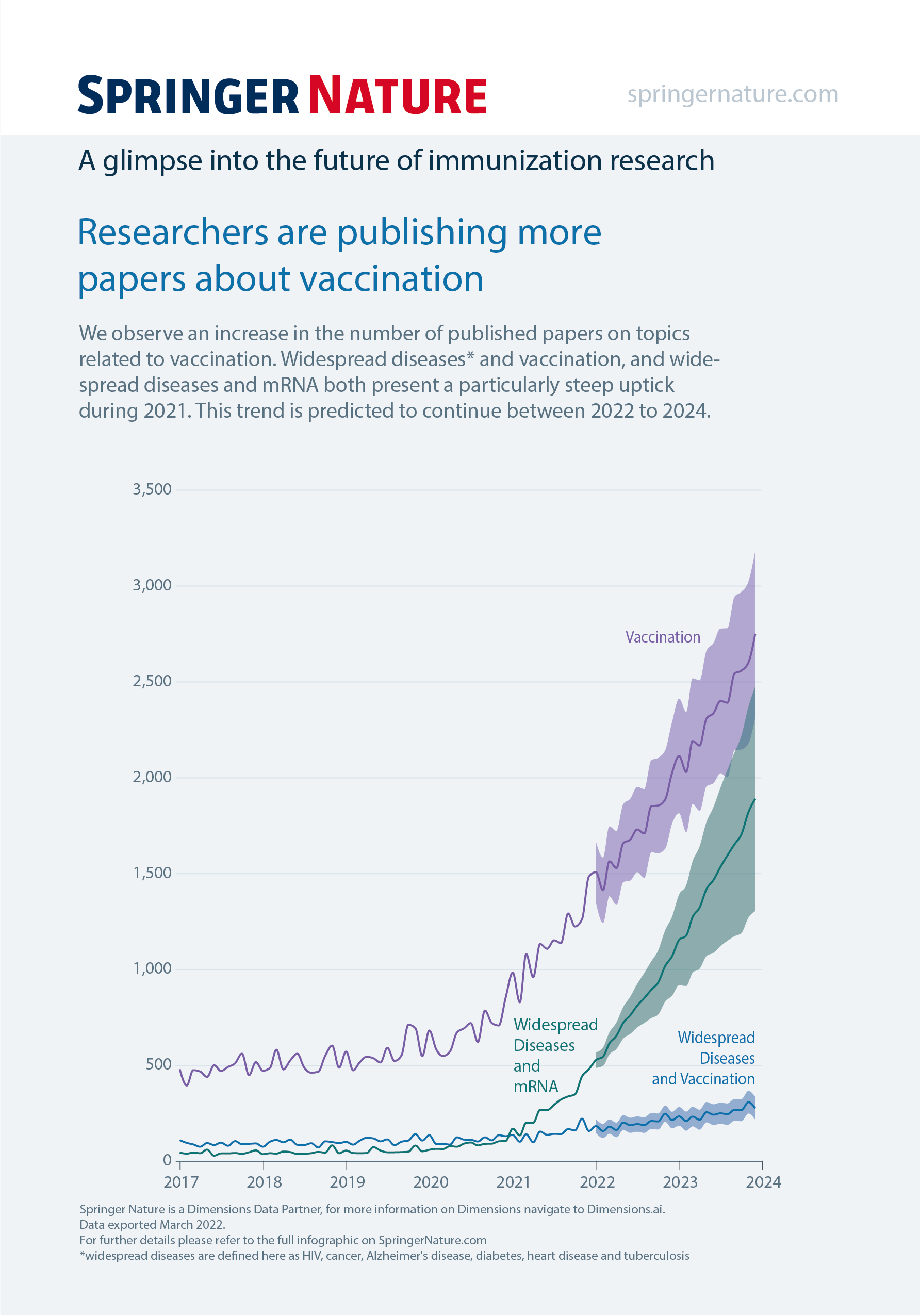
A simple multi-line chart was adopted to convey publishing trends of researchers covering vaccinations. Each mapped line needed to convey uncertainty beyond 2022, the year of production for these visuals. This as acheived via shaded uncertainty envelopes between 2022 and the final data year of 2024 to convey the general increased uncertainty on estimates as time progressed.
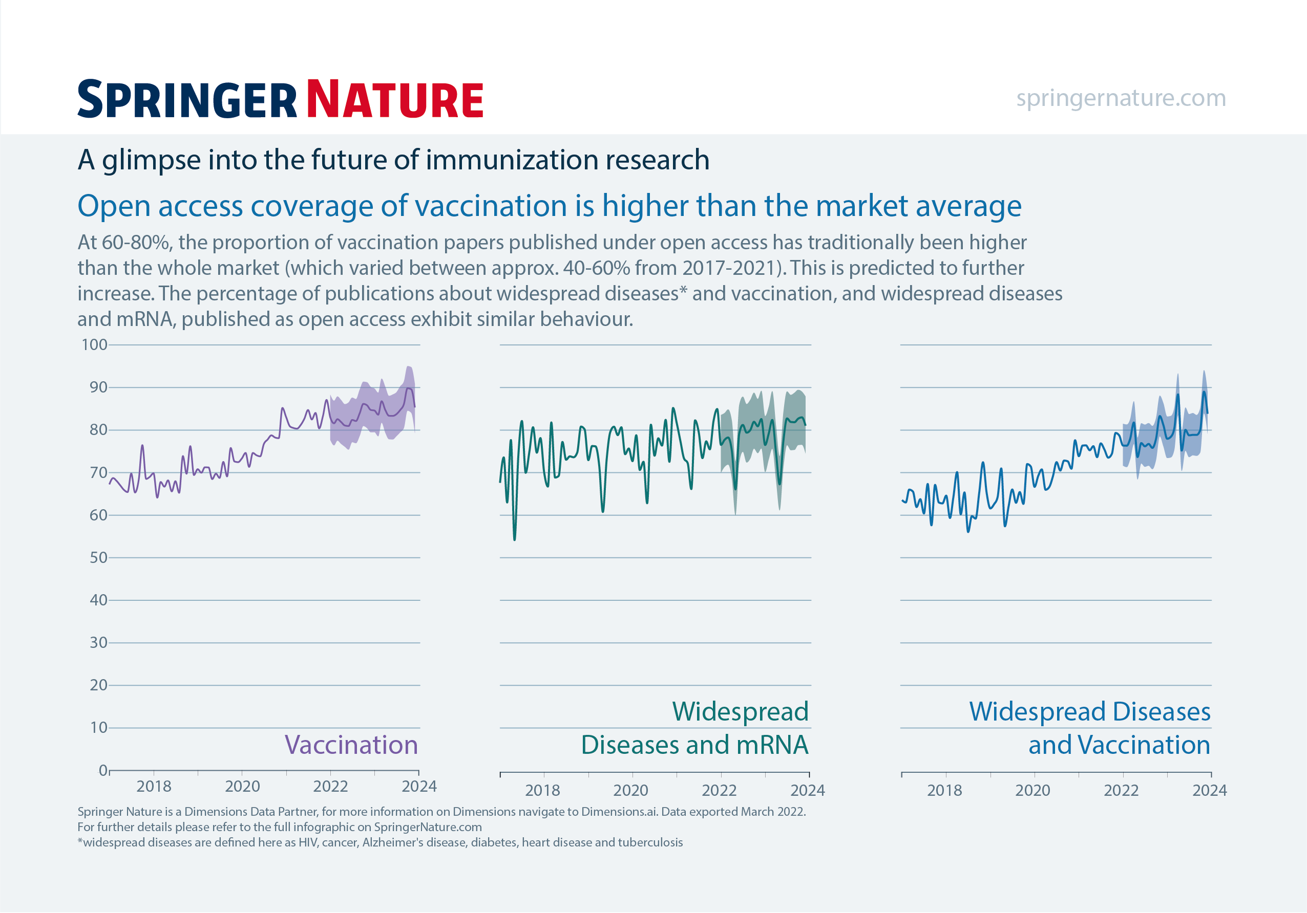
A small-scale 'small multiples' line chart was adopted to convey trends in open access coverage of vaccination compared with the higher than the market average. Such a chart type allows for designers to remove duplicating chart elements; in this instance, the y-axes duplicated on each chart. This allows for the charts to be slightly enlarged , and also declutters the full illustration to improve readbility and legability. Similar use of shaded uncertainty envelopes between 2022 and the final data year of 2024 to convey the general increased uncertainty on estimates as time progressed.
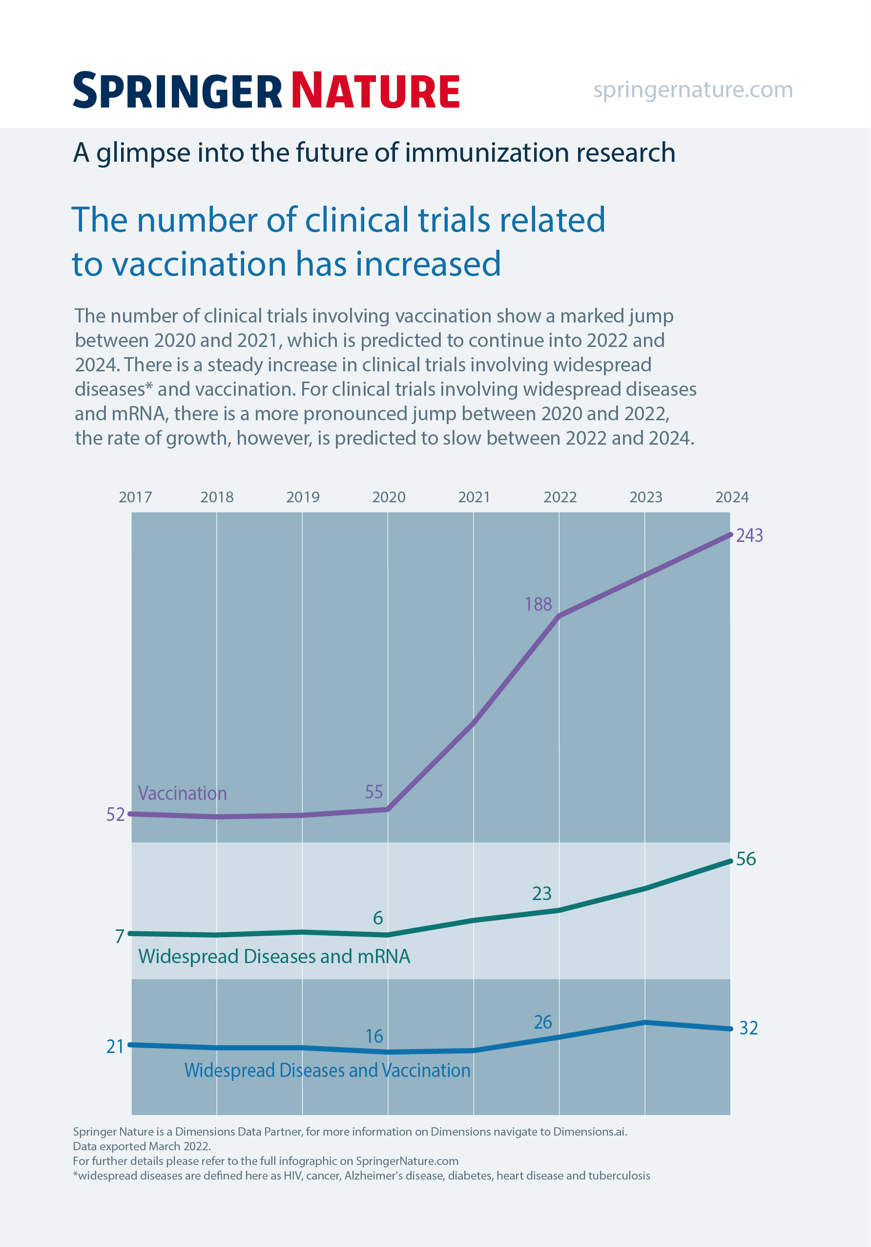
An adapted multi-line chart was used to convey the trend of an increased number of clinical trials related to vaccination. Unlike a traditonal mltiline chart, each data line sits within its own set of cartesian axes; thus also allowing decluttering of the full chart through removal of duplicating x-axis ticks and labels.
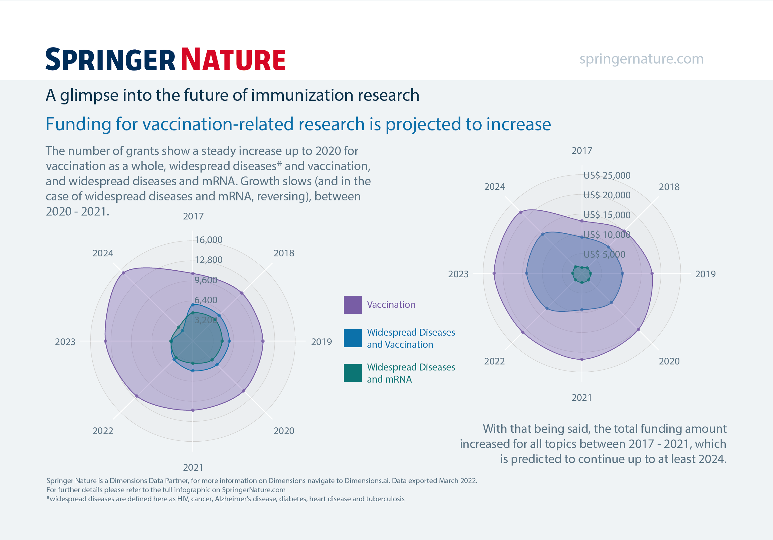
For this digital postcard, aimed at conveying projected funding trends for vaccination-related research, we used a more novel radar plot (also referred to as spider chart, web chart, star chart, polar chart, Kiviat diagram, cobweb chart, or irregular polygon charts) to convery time around a 'clockface' layout. It is equivalent to a parallel coordinates plot, just with the axes arranged radially instead of vertically. Each chart should be read in a clockwise order, and each conveys the same three categories of immuization illustrated in previous digital postcards, to maintain consistency and harmonisation.
See our data in a new light


Nature Research Intelligence
Data & Analytics Solutions
© 2024 Springer Nature Limited