Water Management Quality Politician's Report
Published
12th November 2024
Contributors
Steve Riddell (ACE - Project lead)
Vivek Aggarwal (ACE - Dataset curation)
Pankaj Arvikar (ACE - Dataset curation)
Jack England (ACE - Report writing & consultation)
Inês Pote (ACE - Report writing & consultation)
NRI were asked to produce a client-facing project that highlighted water management research in the EU, presenting the initiatives being taken to improve the quality of river water across a selection of the highest performing river basins in Europe. This summary report (‘politician’s report’) condenses the project’s full technical report (‘expert report’) into key project insights and recommendations for consideration by decision makers.
This shorter report was enriched by carefully curated data
visualisations, helping readers to quickly digest a breadth of
data points and gain insights into the publishing trends, key
actors and grant funding flows of water management research in
the EU, along with subject and geographic classifications of the
project case studies. The analysis housed in this summary report
can be used to inform research and funding decisions,
stakeholder engagement and collaboration strategies. Moreover,
the in-depth classifications of collected case studies were
designed to offer strategic direction for new initiatives to
improve river water quality in the Loire.
Note: To protect client exclusivity, all
illustrations displayed on this page have been anonymized
This project required a small set of [3 or 4] harmonised visuals designed to demonstrate the publishing and funding landscape of water management research in the EU and provide summary evidence of case studies for the actions taken in the EU to improve river water quality. The client’s main requirement of the visualisations in this politician’s report was for them to effectively summarise findings of the 17 figures in the main technical report produced by Nature Research Intelligence. These visuals needed to be drafted, provided to colleagues and the client for approval and finalised in under four weeks. Discussions with colleagues who had authored the full technical report also highlighted five additional requirements the visualisations should achieve, namely:
- interesting, engaging while simple to understand.
- helpful readers to quickly digest a breadth of data points and gain insights into the publishing trends.
- bespoke visuals (that are not available in commercial packages, e.g., Flourish, DataWrapper).
- using harmonised design and corporate-branded colourimetry used throughout
- able to be repurposed on other outlets (e.g., emails, slide decks)

During the consulting phase for the technical report, the Data &
Consulting team learnt that the client greatly appreciates
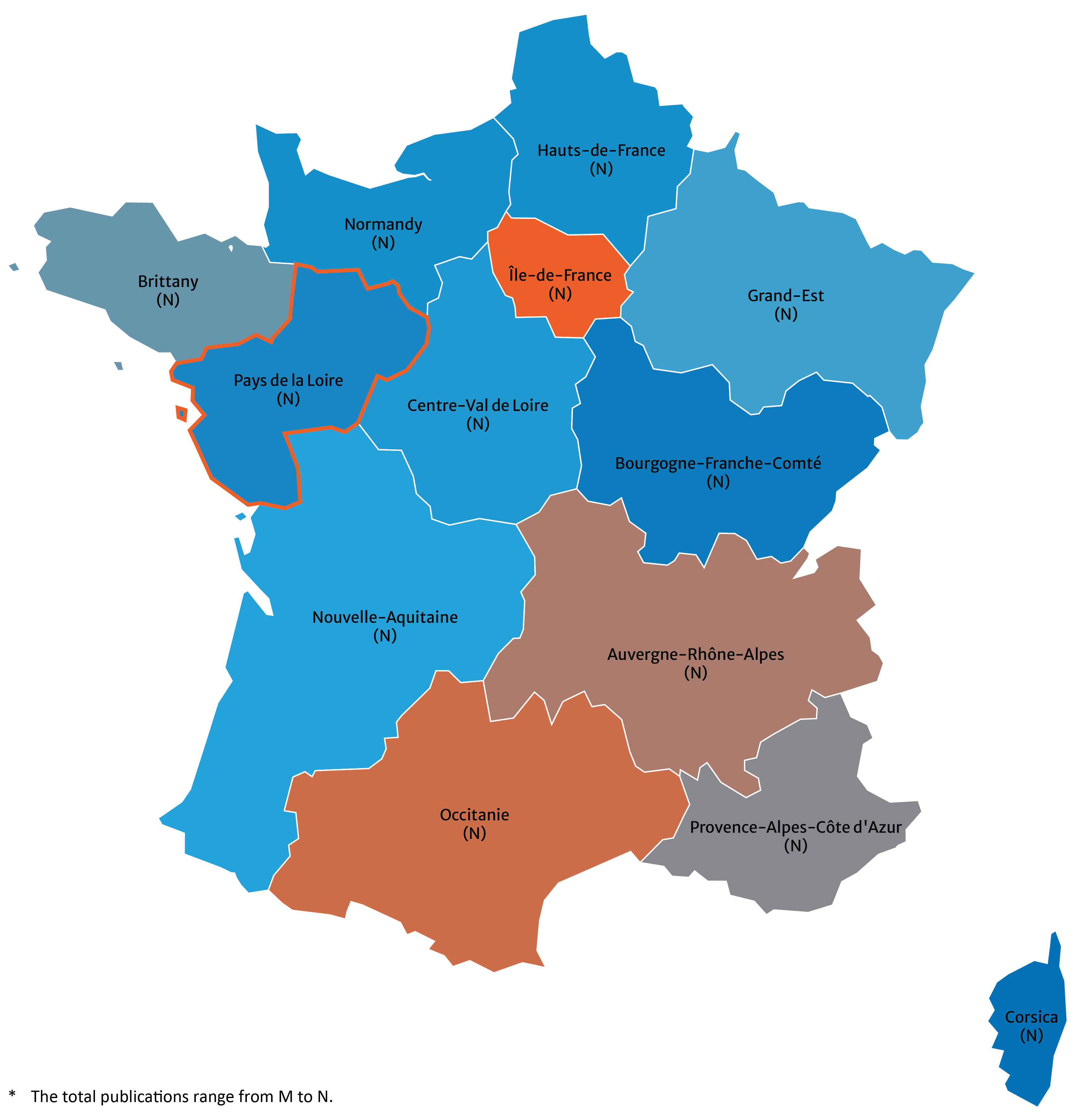
geographical maps as a visualization tool. As such, we designed
a simple choropleth map to highlight the number of research
publications in each (NUTS1) region of France.
We developed a colour ramp palette using the
chroma.js online tool that spanned just three colours
spanning from Nature Orange through dark blue to light blue
using from Nature’s Style Guide. Doing so allowed us to use
Nature Orange – Nature's main highlight colour – to easily
distinguish the region with the highest number of relevant
publications.
Cooler, lighter blue-coloured distinguished regions at the
opposite end of the spectrum. Finally, we added a thick Nature
Orange border highlight to the region of most interest to the
client, Pays de la Loire.
No legend was added as we felt the combination of a discrete
13-colour ramp and effective on-chart annotations along with a
simple footnote to the bottom explaining the encoded value range
would be sufficent to readers to fully understand the data
mapped in Figure 1. Colour ramp legends are also notoriously
difficult to discriminate the truly correct data value from,
epsecially if they are gradient in style as opposed to discrete;
this is even more so when positioned at distance from the
related map. Given publication counts were already labelled
directly on the geo-map, and colour legends are recommended
towards the lower, qualitative end of the Scale of Elementary
Perceptual Tasks (EPTs), we felt there was no need for this
additonal duplicating chart furniture.
We had also considered using a cartogram-style map
boundary. Due to the pressing turn-around time asked of us,
however, sourcing a suitable digital boundary for France,
deciding on an effective, relevant denominator against which to
normalise the raw data and allow modified scaling of the
geographic regions, and the potential difficulty in having to
explain how to intepret such a [more] complex visual to the lay
reader, we opted against such a visual solution.

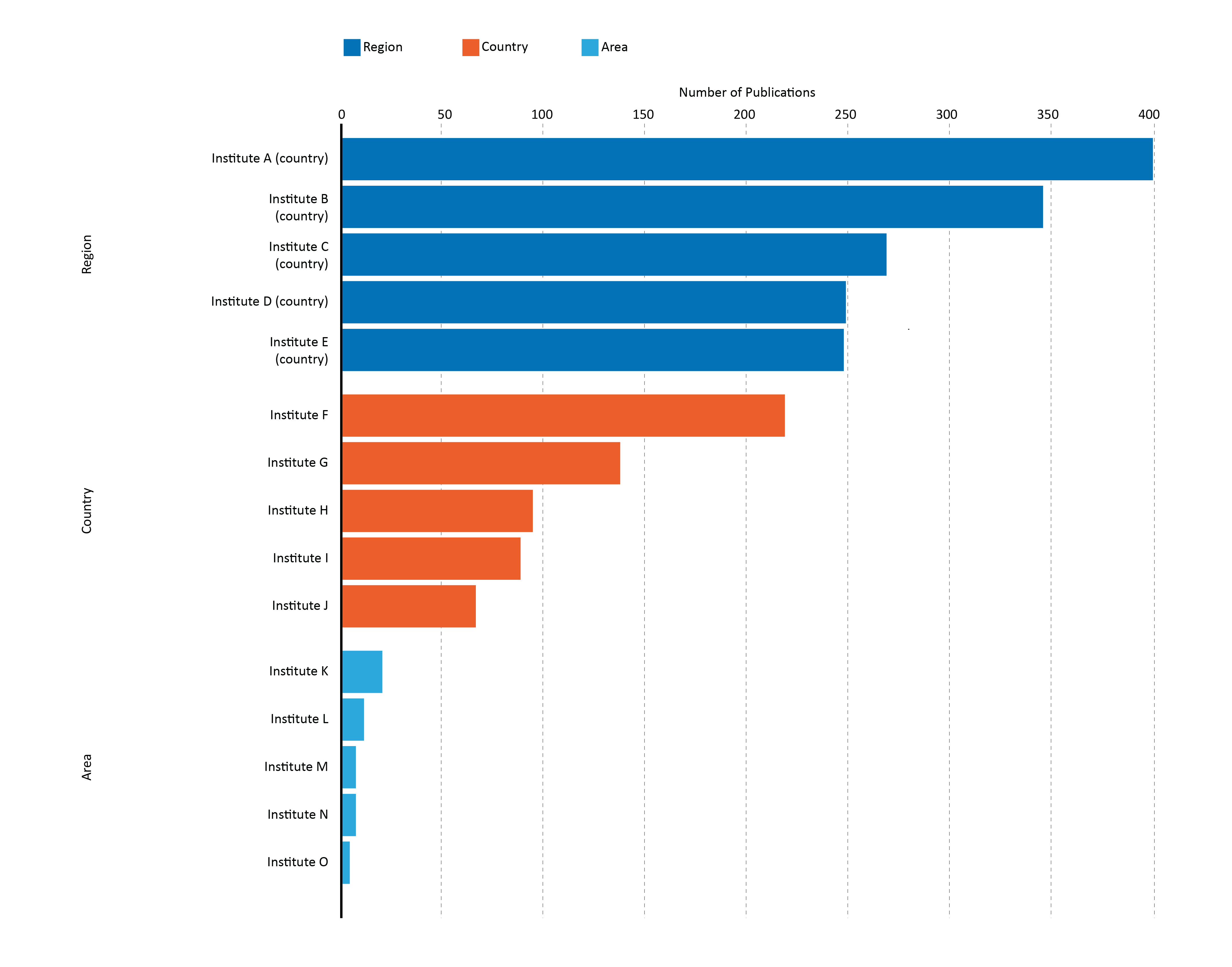
Retaining the three base Nature colours used in Figure 1, we
produced a simple grouped bar chart to illustrate the top five
Key Actors (leading research publishers of water management
research, i.e., research institutes), in the EU, France and Pays
de la Loire (the client’s key geographic region of interest).
'Number of Publications’ is a single-dimension [scalar]
metric mapped against the chart’s x-axis, thus using data bar
length alone to encode data values. This is the best approach to
visualising such a metric as the human eye only needs to compare
[differences in the] lengths of data bars to understand size of
difference in number of publications between each geographic
region.
As we decided to use a bar chart to visualise this data, the
x-axis must start from 0 so as not to distort differences in
data values and lengths of the data bars; this is not a
requirement of other chart types that we could alternatively be
used to encode this metric, for example, dot plots, lollipop
charts (though it is preferable).

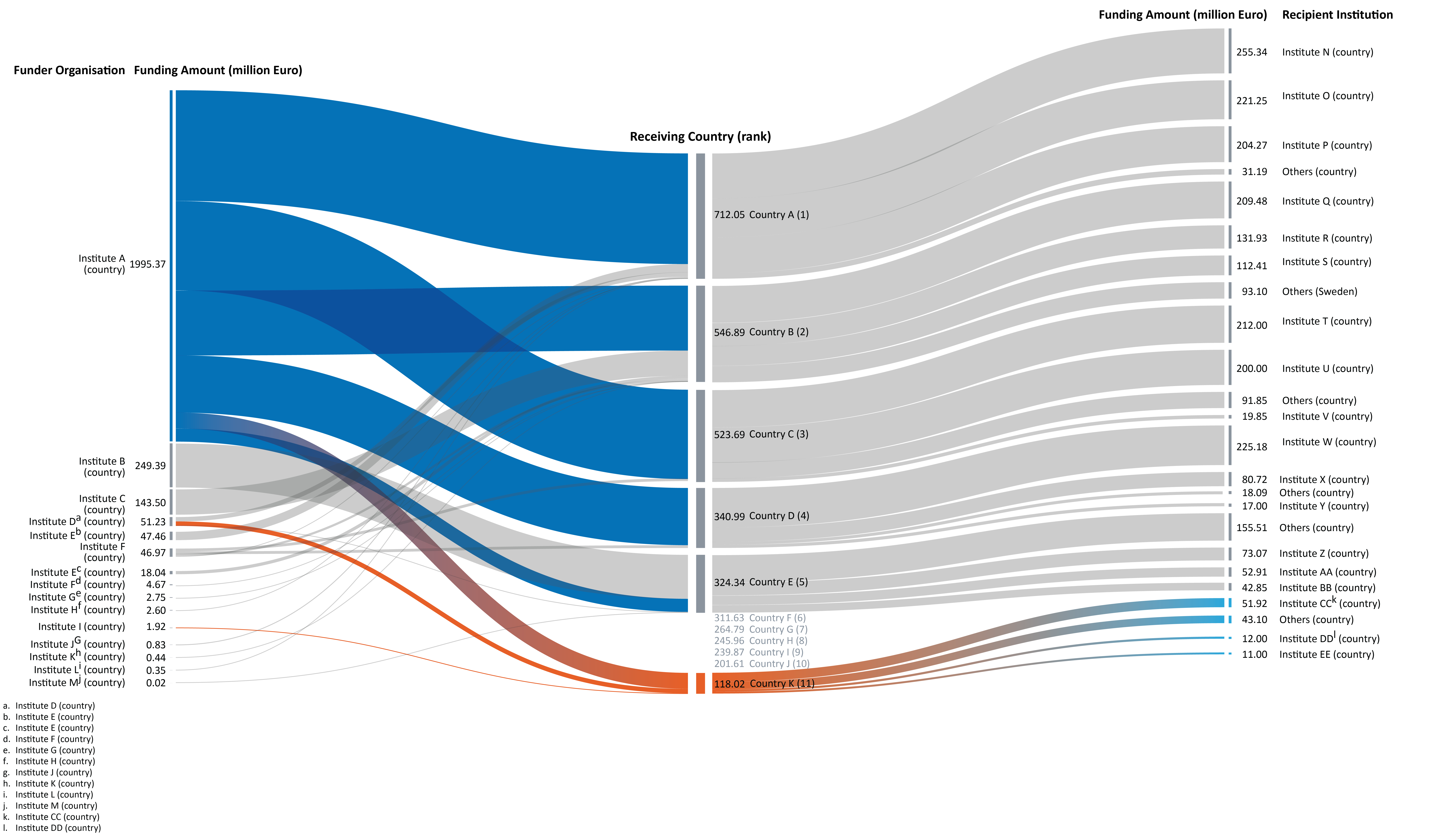
Figure 3 introduced a more exotic Sankey chart to the report, an interesting alternative visual way to encode and communicate flows between entities, and illustrating here Funder-Receiver-Recipient funding flows within the European Union. A number of significant conscious design decisions were made to refine and improve this visual to its final form. For example:
- Underlying data was initially filtered to reflect only the top five receiving countries and France within the EU. This was to ensure a cleaner, less cluttered final visual.
- Funder nodes on the left-hand side were sorted top-to-bottom in descending order of funding amount (million Euro), emphasising the magnitude and discrepancies of this funding.
- Overly long labels were abbreviated where possible to declutter the left and right extents of the visuals.
- Receiver nodes in the middle were sorted top-to-bottom in descending order of amount received (million Euro).
- To emphasise the fact that France is actually ranked outside the Top 10, we introduced value-added information in the gap created between France and the country ranked 5th, thus outlining those countries – and their received funding amount - ranked positions 6 to 10. This additional information was provided to prevent readers mistakenly reaching the assumption that France was ranked position 6, not in position 11.
- Only the top three recipient institutes (right-hand nodes) are displayed, with the remainder consolidated into ‘Others’ for each Receiver country. This was to ensure a cleaner, less cluttered final visual. Including all recipients from all considered receiver countries would have resulted in a messy, confusing, unintelligible visualisation.
-
The same three core colours from Nature’s style guide were
again adopted to highlight:
- The largest funder within the EU and the amount of funding released to receiving countries.
- Recipient institutions within the EU receiving funding for water management research projects.
- Magnitude and direction of funding from France to its top three recipient institutions.

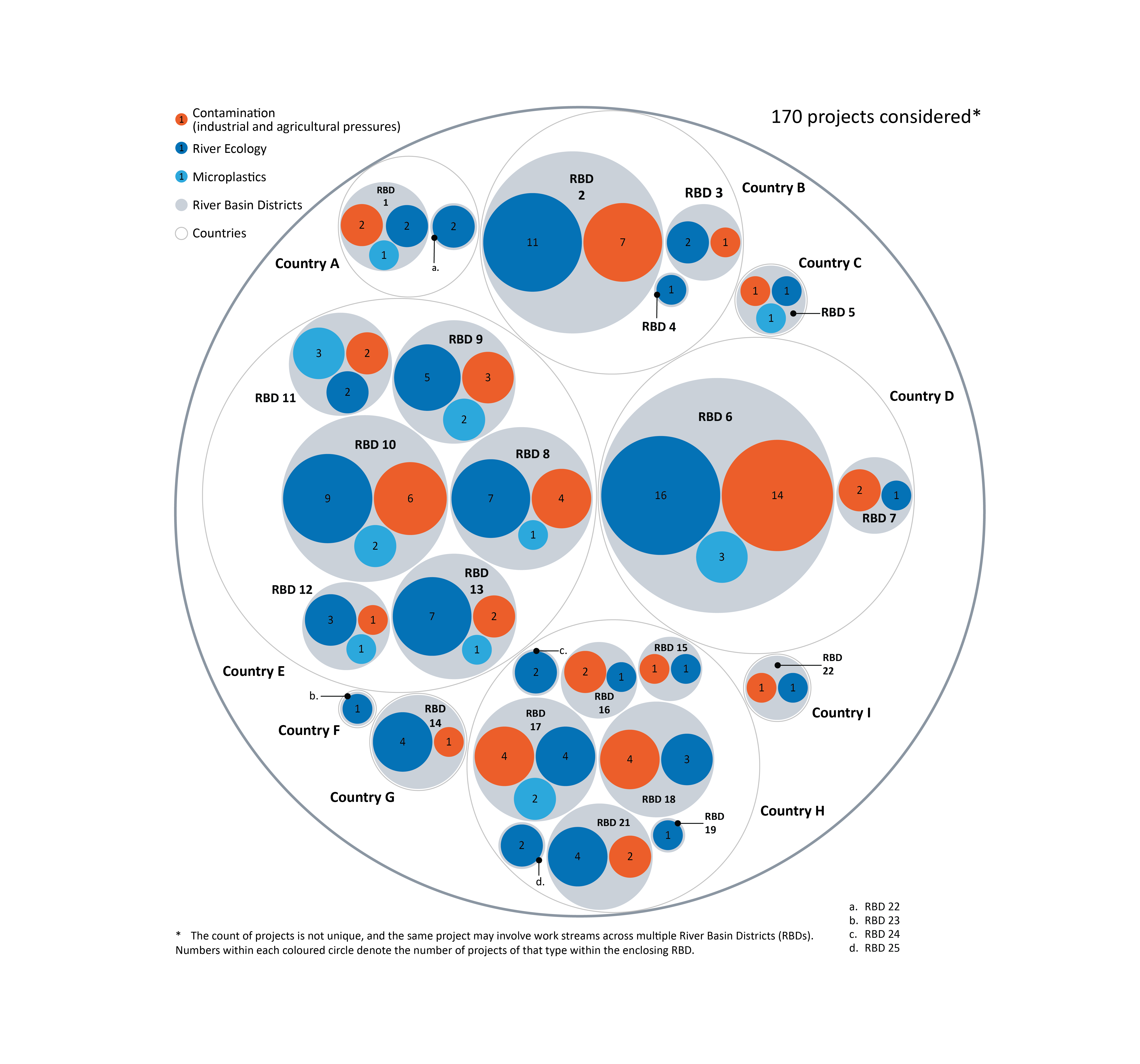
Sticking with more novel forms of visualisation, a circle-packing chart was adopted to encode the number of water management projects taking place in European river basins identified as being 'high performing' based on data from the European Environment Agency (EEA). Ensuring the aim for chart colour harmonisation across all visuals, the three-colour set was applied here to chart the total projects dedicated towards resolving each of the key problems identified with river water quality in the Loire:
- Contamination (industrial and agricultural pressures)
- River Ecology
- Microplastics
Only the individual coloured circles of this visualisation’s lowest layer are scaled truly corrected to the values encoded. All intermediate layers – i.e., River Basin Districts, Countries and the EU (the outer, largest enclosing circle) – only approximately scale to the counts aggregated from levels; they are not space-filling.
Perhaps considered a deficiency in this type of chart, we felt this was an acceptable compromise to still conveying the underlying data values to the reader. Its adoption also introduced a different, more challenging visual to the more traditional accepted norm of a bar, column, or line chart. A more practical chart alternative would be a tree-map, as each geometric space is space-filling, regardless of level within the hierarchy.
See our data in a new light
Nature Research Intelligence
Data & Analytics Solutions
© 2024 Springer Nature Limited