The innovation and collaboration landscape in China - opportunities, risks and future engagement
Completed
April 2025
Contributors
Steve Riddell (ACE - Project lead)
Vivek Aggarwal (ACE - Dataset curation)
Pankaj Arvikar (ACE - Dataset curation)
Jack England (ACE - Report writing & consultation)
Inês Pote (ACE - Report writing & consultation)
Nature Research Intelligence (NRI) were commissioned by a high-profile UK funder to produce a scoping study focused on innovation in China, with a view to inform and enhance the UK-China partnership on research and innovation for the benefit of the UK economy. To develop a more robust understanding of China’s current innovation capabilities and potential strategies for future engagement, the study set out to address the following specific objectives:
- Assess the economic case for engagement with China on innovative collaboration, mapping China’s sectoral strengths in commercialisation and innovation to the UK’s strategic priorities.
- Analyse China’s academic research and innovation funding landscape, including the mechanisms that support international partnerships and business start-ups in China.
- Identify opportunities, barriers, and risks to collaborating with China by exploring how countries that are comparable to the UK are engaging on academic research and innovation in and with China.
- Gather evidence of how UK businesses are forging alliances within China’s innovation ecosystem, highlighting successful engagement models for collaborating with and in China.
- Provide recommendations for future UK-China collaboration on commercialisation and innovation, focusing on strategies for mutual benefit and risk mitigation.
Note: To protect client exclusivity, all illustrations displayed on this page have been anonymized
This project required a set of harmonised factsheets and visuals designed to illustrate Chinese Market Share of patents in selected areas of expertise and interest. Discussions with colleagues who had authored the full technical report also highlighted five additional requirements the visualisations should achieve, namely:
- interesting, engaging while simple to understand.
- helpful readers to quickly digest a breadth of data points and gain insights into the publishing trends.
- bespoke visuals (that are not available in commercial packages, e.g., Flourish, DataWrapper).
- using harmonised design and corporate-branded colourimetry used throughout
- able to be repurposed on other outlets (e.g., emails, slide decks)
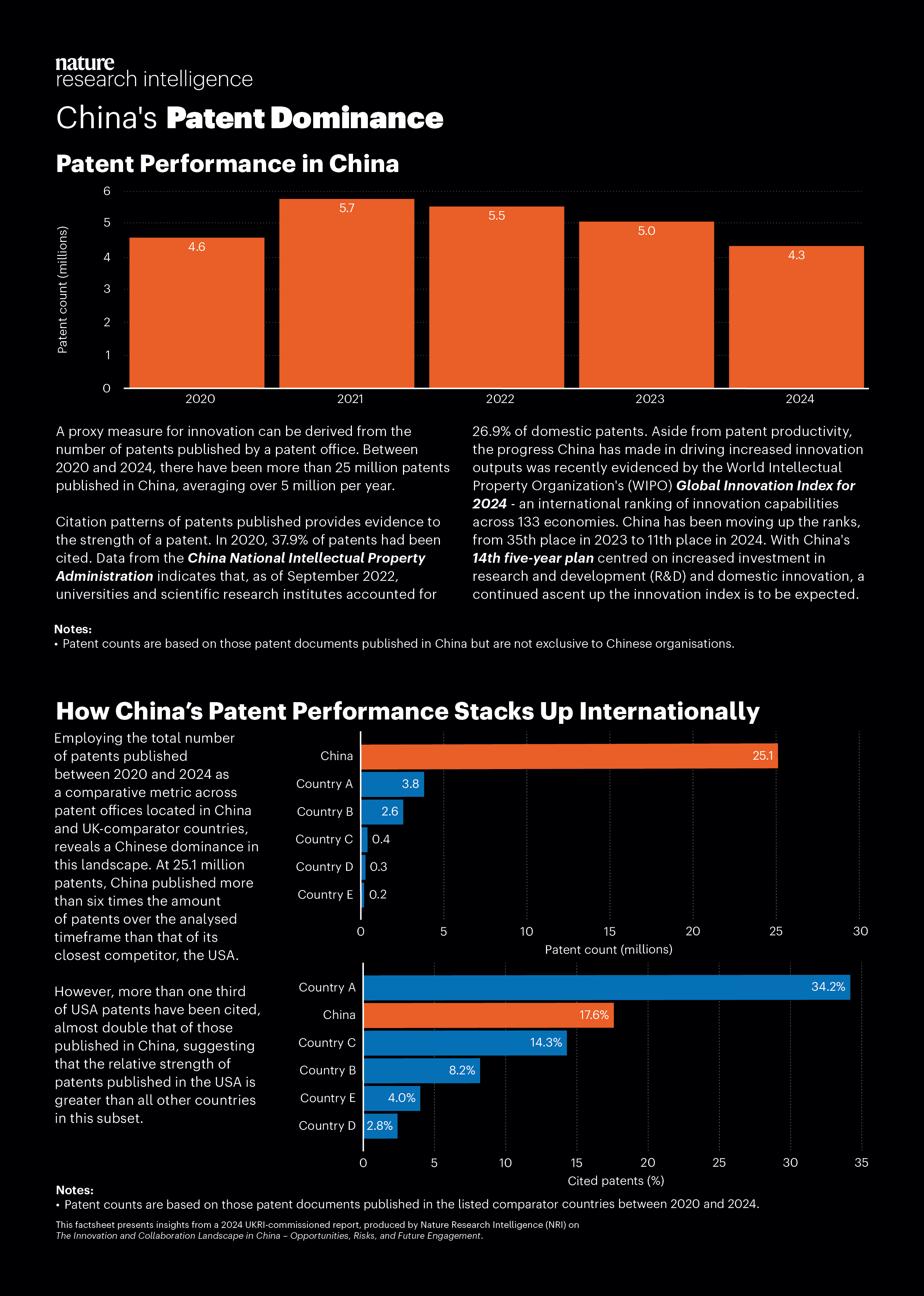
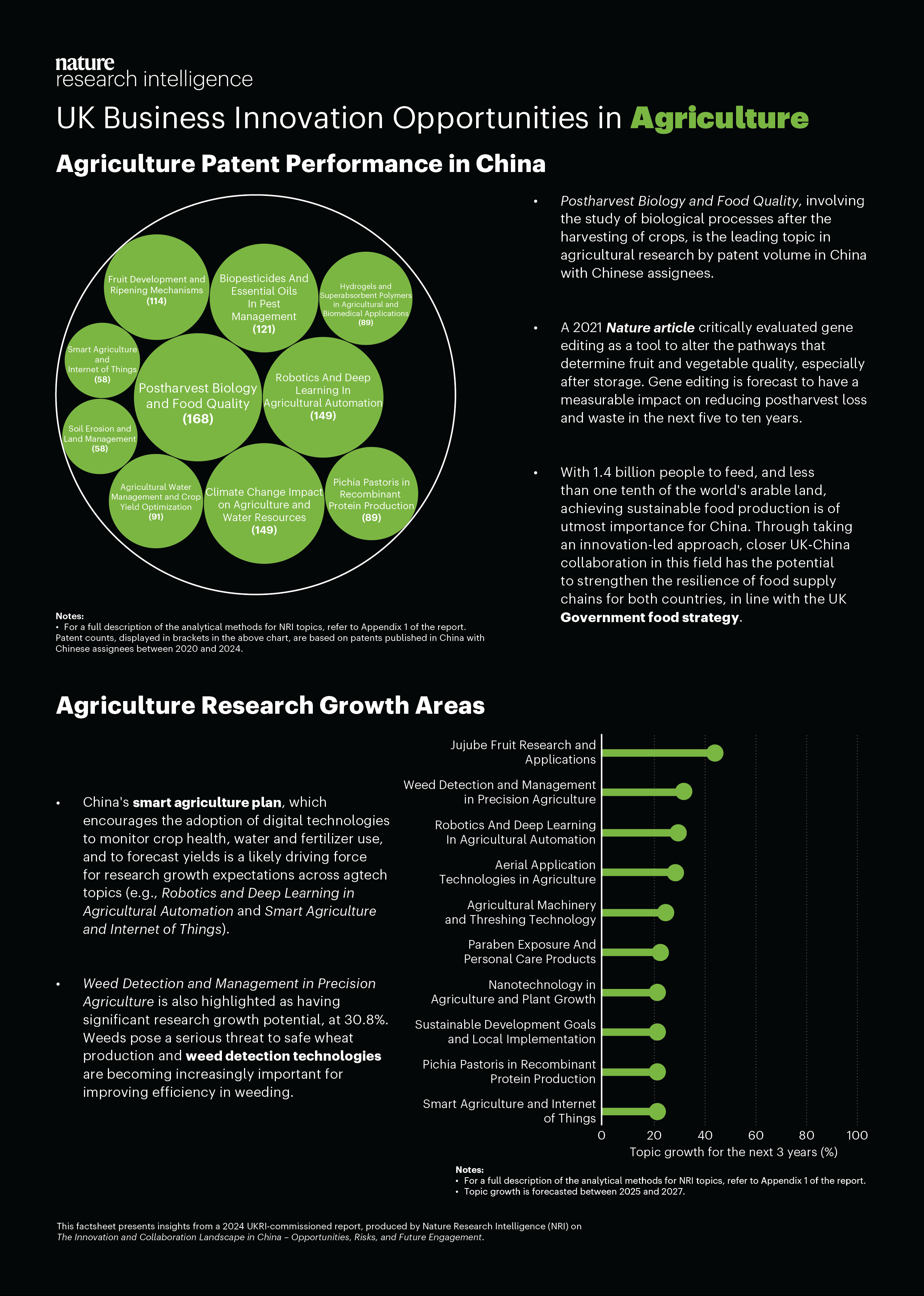
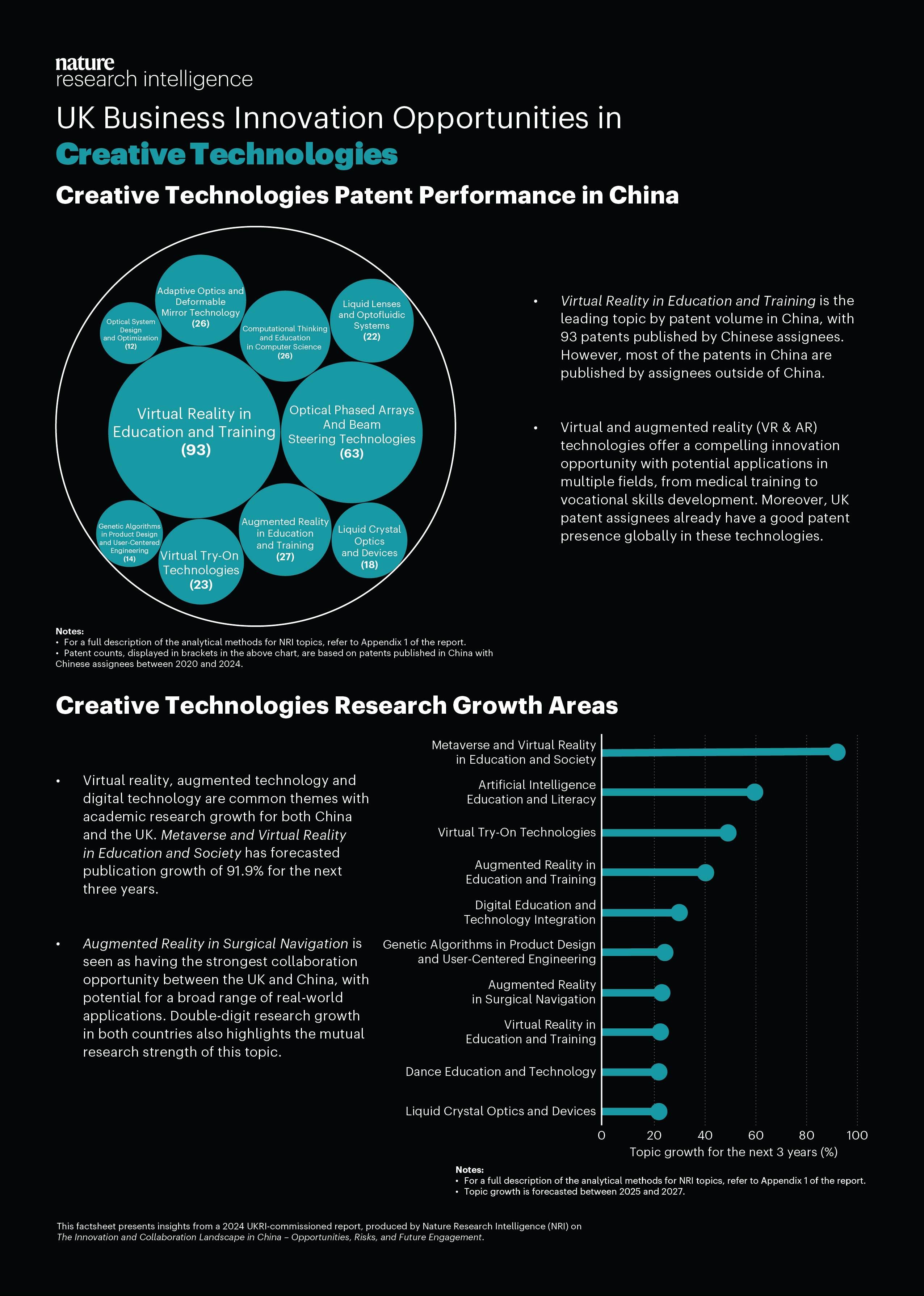
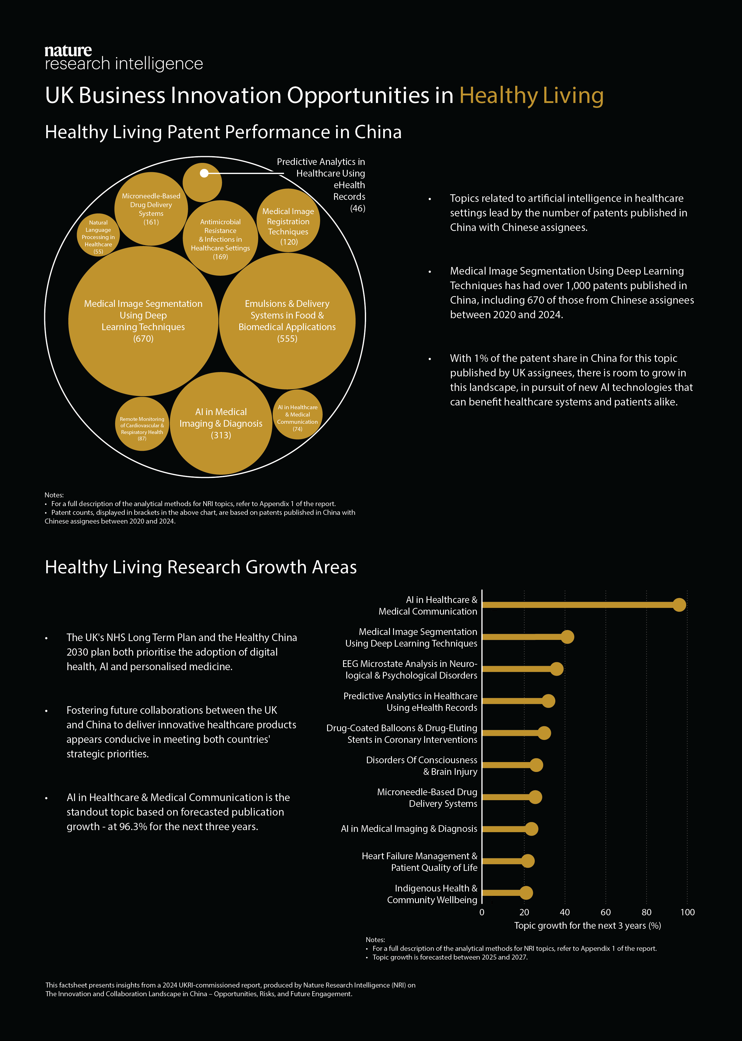
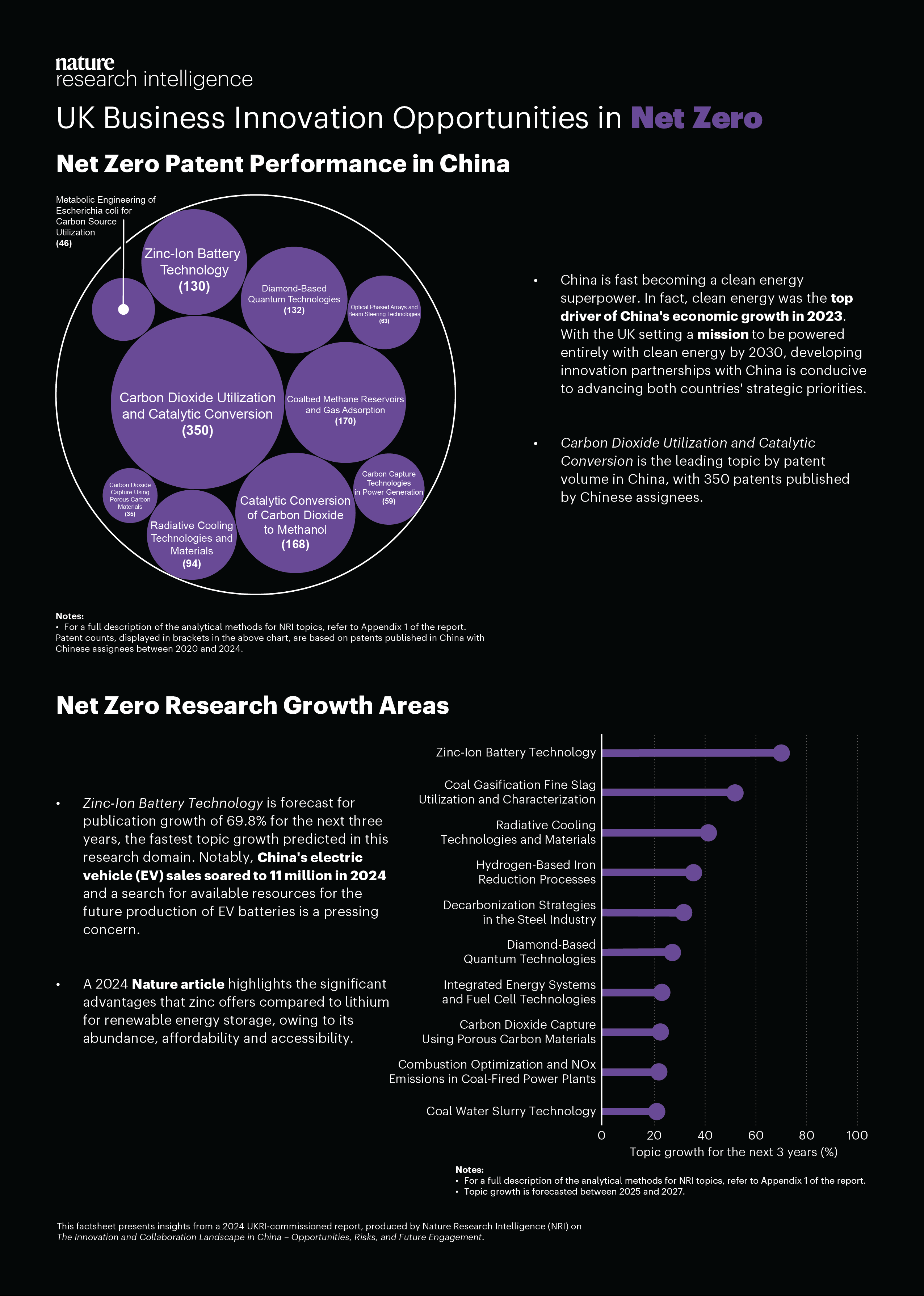
We produced five standalone factsheets that together map the
patent landscape in academic research across China: one
country-level overview and four focused sheets for Net Zero,
Agriculture, Creative Technologies, and Healthy Living. Each
factsheet condenses patent activity into a single-page
narrative: high-level metrics (patent counts, top competitor
countries), a short interpretive summary, some simple visuals
(circle packing charts, bar and column charts), explaining
notable research clusters. The country overview gives context —
overall growth, geographic hotspots, and cross-sector themes —
while each subject factsheet zooms into domain-specific
patterns, technology subfields and growth areas, and emerging
gaps that will likely matter to researchers, tech transfer
officers, and policymakers in the future.
Design choices were driven by a single constraint: make the
factsheets immediately usable. That meant pared-down language
and two dominant visuals on each factsheet (i.e. no dense
tables). Colour and layout are used to group information
logically rather than to merely decorate, and a small number of
key takeaways to summarise our findings.
We intentionally kept each factsheet bite-sized so it fits into
an email, a slide, or a decision memo. Readers can use them in
different ways: a quick executive scan to spot where investment
is clustering, a conversation starter in collaboration meetings,
or a checklist for further investigation (e.g., which countries
or topic areas to concentrate on). The result is a compact,
transparent suite of factsheets that balance rigor with clarity
so stakeholders can grasp the Chinese academic patent landscape
quickly and act on what they learn.
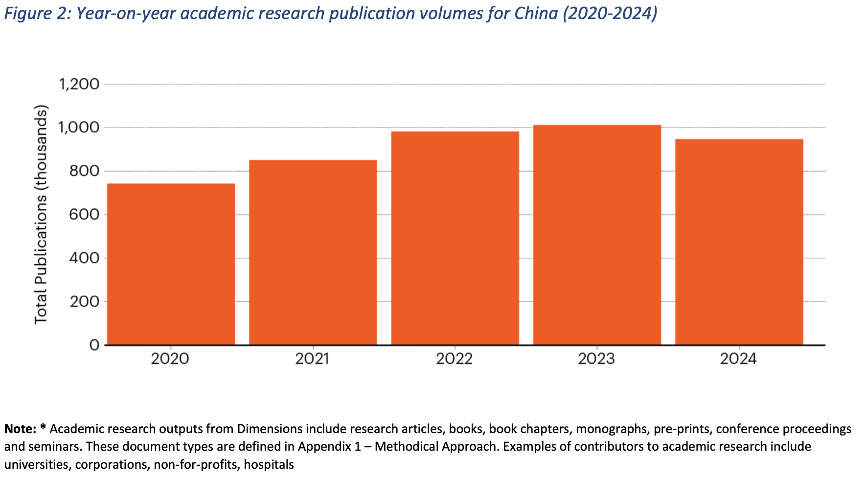
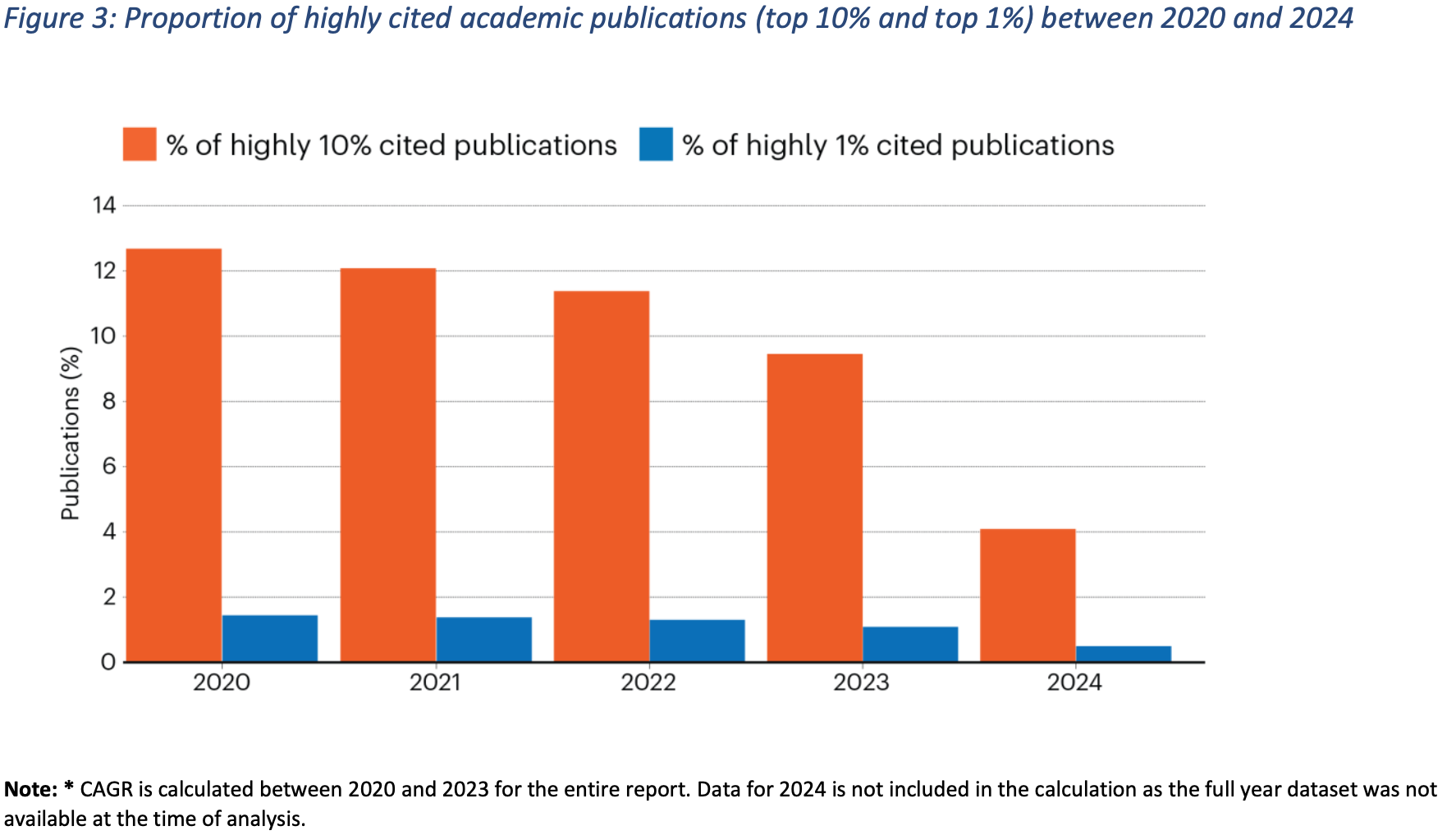
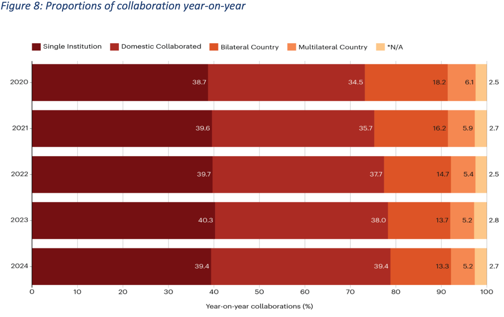
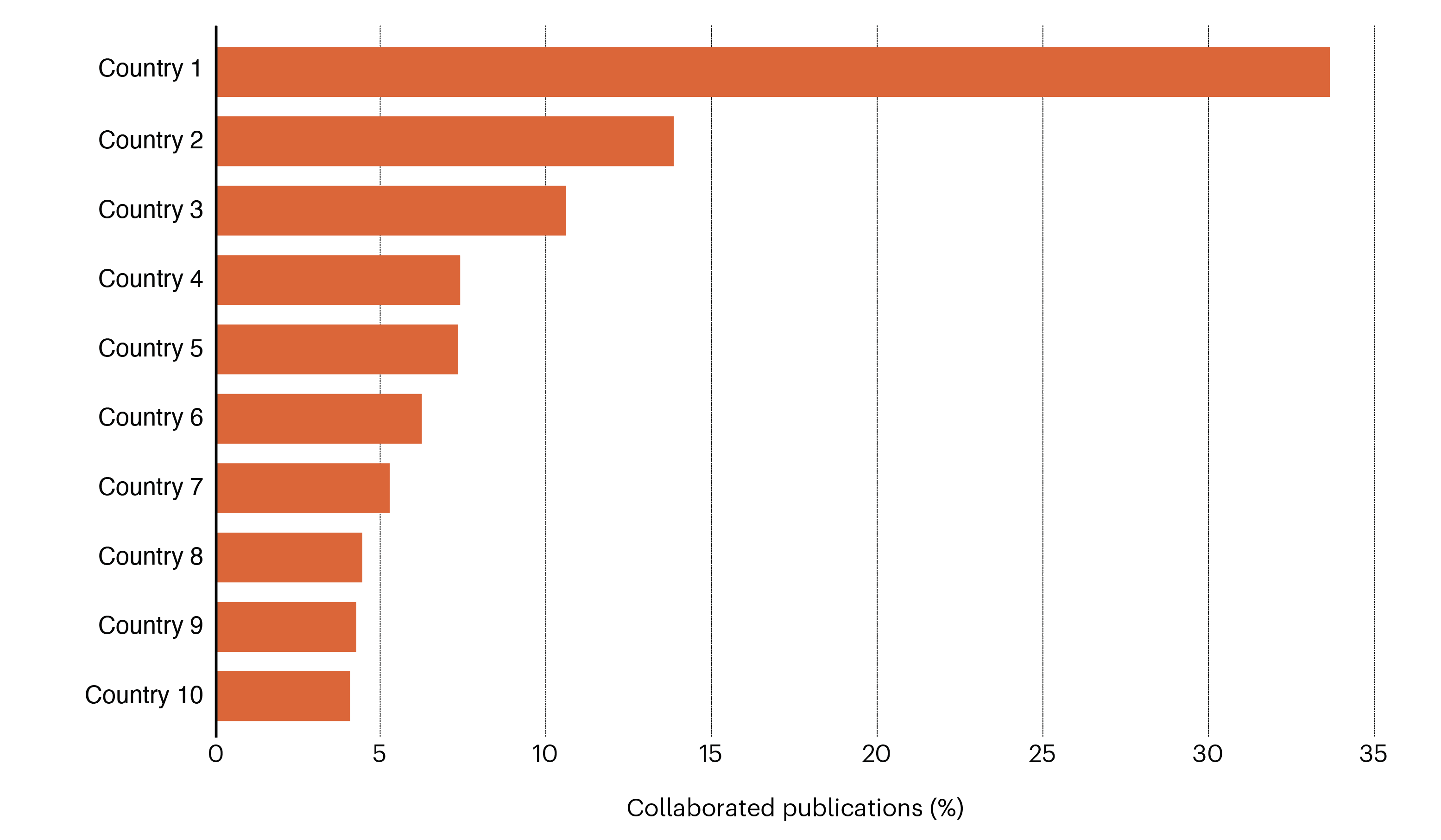
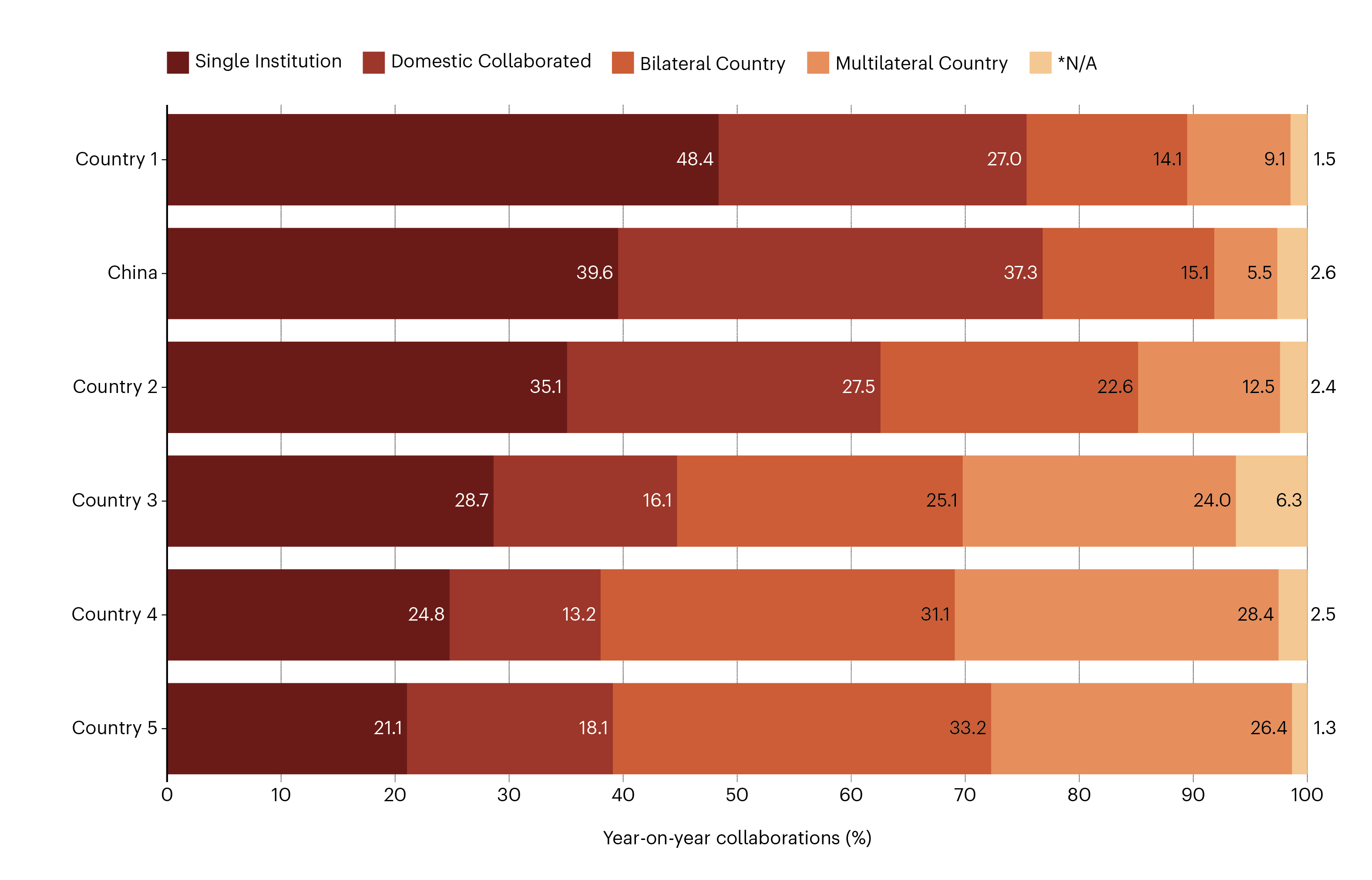
For the report on Chinese Innovation and Collaboration, a suite
of simple yet effective charts and illustrations was created to
communicate complex data clearly and accessibly. The focus was
on using straightforward visual formats — primarily traditional
bar and column charts — to present key comparisons and trends
without overwhelming the reader. These charts highlight metrics
such as research output, collaboration intensity, and innovation
performance, offering quick visual insights into China’s
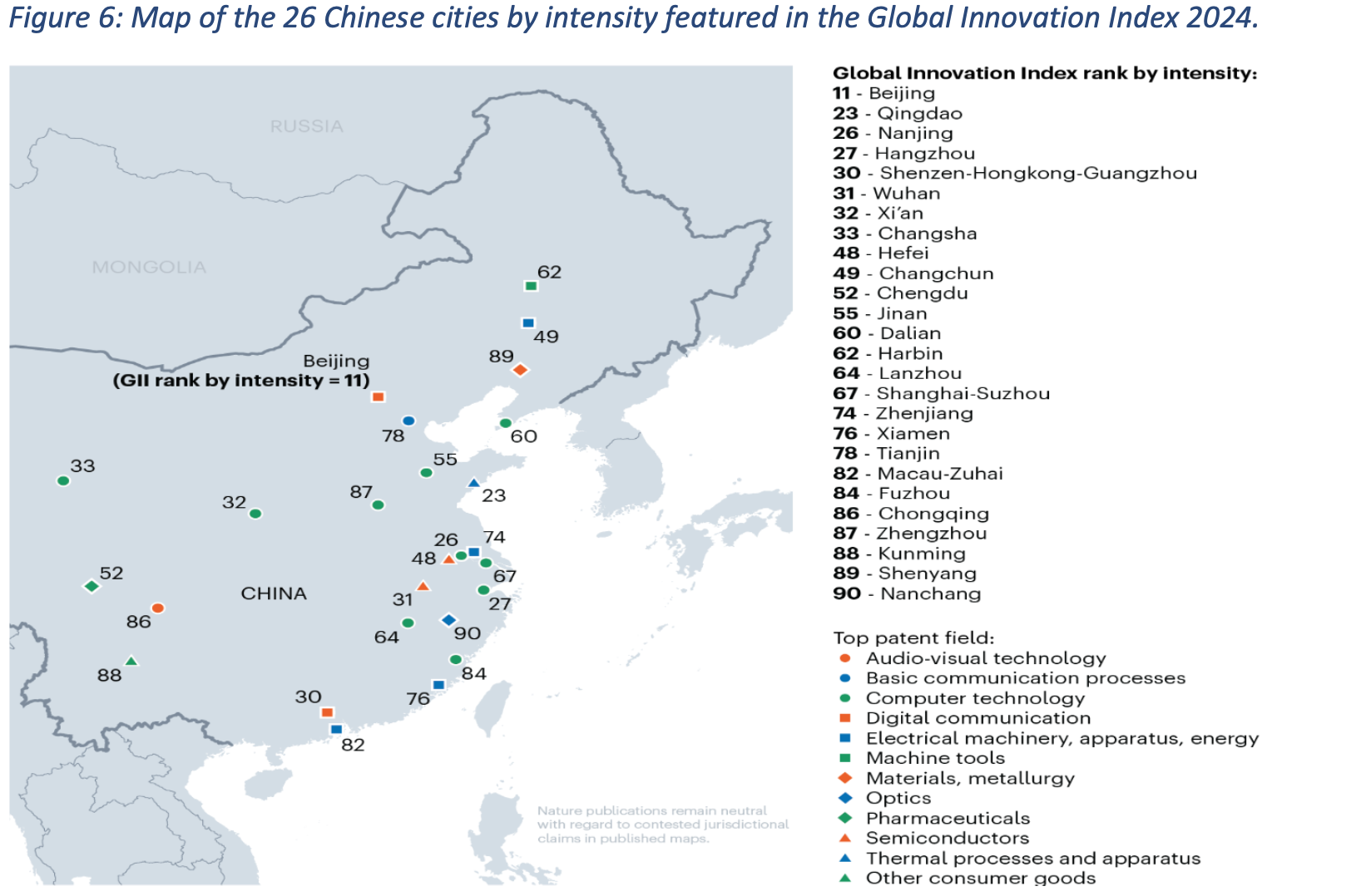
position in the global innovation landscape. In addition to
these, a single, cleanly designed map was developed to locate
the top 26 institutes based on the Global Innovation Index,
ranked by intensity. The map provides a spatial dimension to the
data, allowing readers to see geographic patterns and regional
strengths at a glance.
The design philosophy behind these visuals was rooted in clarity
and simplicity. By limiting the visual forms to familiar chart
types, the data remains approachable to a broad audience — from
policymakers and academics to industry professionals. Each
visual element was created to serve a specific communicative
purpose, with no unnecessary embellishments or distractions.
Labels, scales, and titles were kept concise and intuitive,
ensuring that readers can immediately interpret the figures and
understand the story each chart tells. Consistency across the
set was also key; uniform layouts and axis formats make it easy
to navigate from one graphic to another while maintaining a
cohesive visual narrative throughout the report.
Colour played a particularly strategic role in the visual
design. A restricted palette of Nature Orange and Blue was
chosen to create visual harmony and maintain focus, while also
aligning with the overall design aesthetic of the report. This
consistent use of colour reinforces the report’s central focus —
China’s innovation performance — while allowing the viewer to
easily track its relative position across multiple dimensions of
data.
Overall, the design approach balanced professionalism with
readability, prioritising substance over style. By using simple
chart forms, a minimal colour scheme, and careful visual
hierarchy, the resulting graphics support the report’s goal: to
provide an informative, visually coherent overview of China’s
innovation and collaboration strengths in a way that is both
engaging and easy to interpret.
See our data in a new light


Nature Research Intelligence
Data & Analytics Solutions
© 2024 Springer Nature Limited