Going Big On Nanotechnology
Published
January 2023
Contributors
Steve Riddell (ACE - Project lead)
Amanda Rider (Partnership & Customs Media - Chief Editor APAC )
Romina Nanwani (Marketing Planning Product & Solutions - Senior Marketing Manager)
Sou Nakamura (Impact Solutions - Art Director)
Demonstrating our competencies with research data is fundamental for enticing users into our research intelligence ecosystem. Creating marketing material with visually-rich insights into an emerging research area can help attract new audiences and direct online traffic towards the Nature Research Intelligence microsite.
Using Nature Index data from 2015 to 2021, this infographic spotlights the significant research growth experienced in the field of nanotechnology and reveals the leading institutions publishing in this landscape. The data analysis concludes with a view of high-profile collaborations on nanotechnology research at a country and entity level.
Simple visuals were used to highlight global publication variability in research into nanotechnology between 2015 and 2021. This conference flyer handout needed to quickly engage readers, conveying key publishing trends easily, clearly and concisely, without risk of confusing or alienating the target audience. As a result, we could not stray too far from using more traditional chart types, familiar to all. Further, such charting forms are already regularly used to convey data of Nature Index, so a precedence was set in advance for NRI to adhere to.
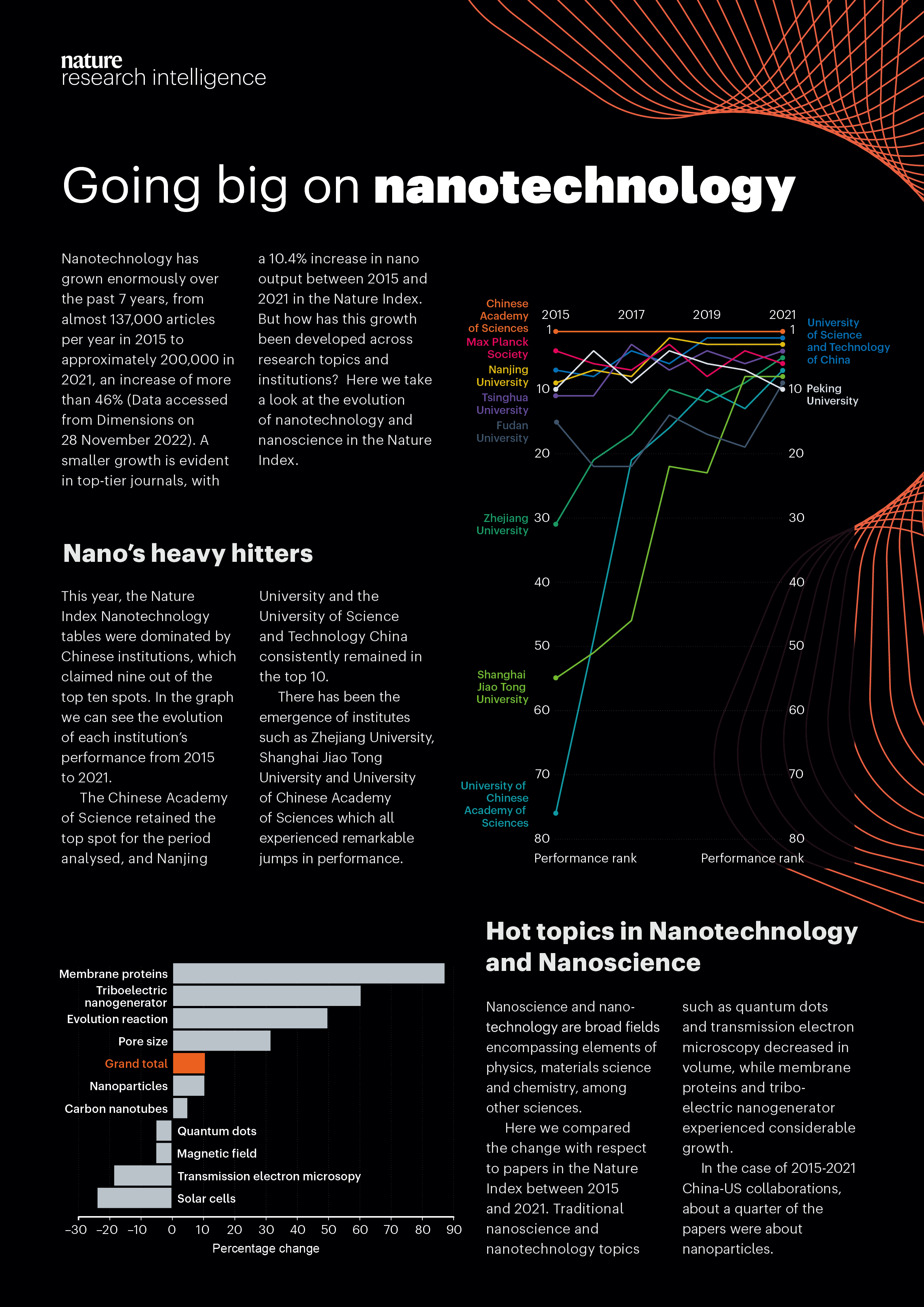
A rank line chart is an effective tool for displaying the relative ranking positions of research institutes worldwide based on their publication performance in nanotechnology between 2015 and 2021. One of the main benefits of using this chart type is its ability to clearly visualize shifts in rank over time, offering a straightforward representation of how research institutes have progressed or declined in their publishing performance. Unlike bar charts or pie charts, which primarily show static values or proportions at a given point in time, a rank line chart emphasizes the change in relative performance and allows for easy comparison of trends across multiple institutes over the six-year period. This helps to track institutions’ improvements, steady progress, or declines, making it easier to identify which institutes are consistently leading or losing ground in the field of nanotechnology research.
Additionally, rank line charts are beneficial because they effectively display relative positioning rather than absolute values. In the context of research performance, absolute publication counts may not provide as clear an understanding of how institutes compare to one another. For example, an institution might publish a large number of articles but still rank lower than others due to the quality and impact of its research. A rank line chart focuses on the relative rankings, which can be a more accurate reflection of performance in comparison to others within the same field. This allows stakeholders to assess the competitiveness and positioning of institutes based on their contribution to the field, as opposed to just their overall volume of publications.
Moreover, rank line charts provide a clean, intuitive way to identify patterns and anomalies across multiple years. This is particularly useful when analyzing research trends over time, such as the emergence of new leaders in the field or shifts due to changes in funding, collaborations, or institutional strategies. For instance, a sudden rise in rank for a previously lower-performing institution might indicate a breakthrough or strategic initiative, which could be important for understanding the dynamics of the global nanotechnology research landscape. Other chart types, like stacked area charts or heatmaps, might obscure such nuanced insights, as they typically emphasize aggregates or distributions rather than rank-based comparisons.
Finally, rank line charts are particularly useful for academic and policy-oriented audiences who are interested in making decisions based on the relative standing of institutions rather than their absolute productivity. These charts offer a clear, at-a-glance understanding of competitive positioning, enabling researchers, policymakers, and funding agencies to make informed decisions about where to direct resources, collaborations, or recognition based on the relative strength and performance of institutes in the field of nanotechnology research.
A diverging bar chart is particularly useful for displaying the relative proportional change in publication volume for the hot topics in nanotechnology scientific publications, as it allows for a clear visual representation of both positive and negative shifts in publication volume between 2015 and 2021. This chart type’s unique design, where bars diverge from a central axis, enables easy comparison of how different research institutes have either increased or decreased their publication output on specific nanotechnology topics. By showing the magnitude of change in opposite directions—such as a rise in publications for some topics and a decline for others—this visualization method quickly highlights the areas of growth and the declining interests or research trends, providing immediate insight into the evolution of nanotechnology topics across global research institutes.
In comparison to other chart types, such as line or column charts, diverging bar charts offer a more nuanced understanding of proportional change. While line charts might show overall trends, they may not effectively capture the specific shifts in publication volume across multiple topics. Similarly, a stacked bar chart could become cluttered when displaying a wide variety of topics and research institutes, making it difficult to interpret individual changes. The diverging bar chart, however, provides a clear, side-by-side view of positive and negative changes in a concise and easily interpretable format. This allows researchers, policymakers, and funding organizations to quickly assess the relative performance of research institutes and pinpoint areas of emerging or waning interest within the global nanotechnology landscape, fostering better decision-making and resource allocation based on trends in research focus.
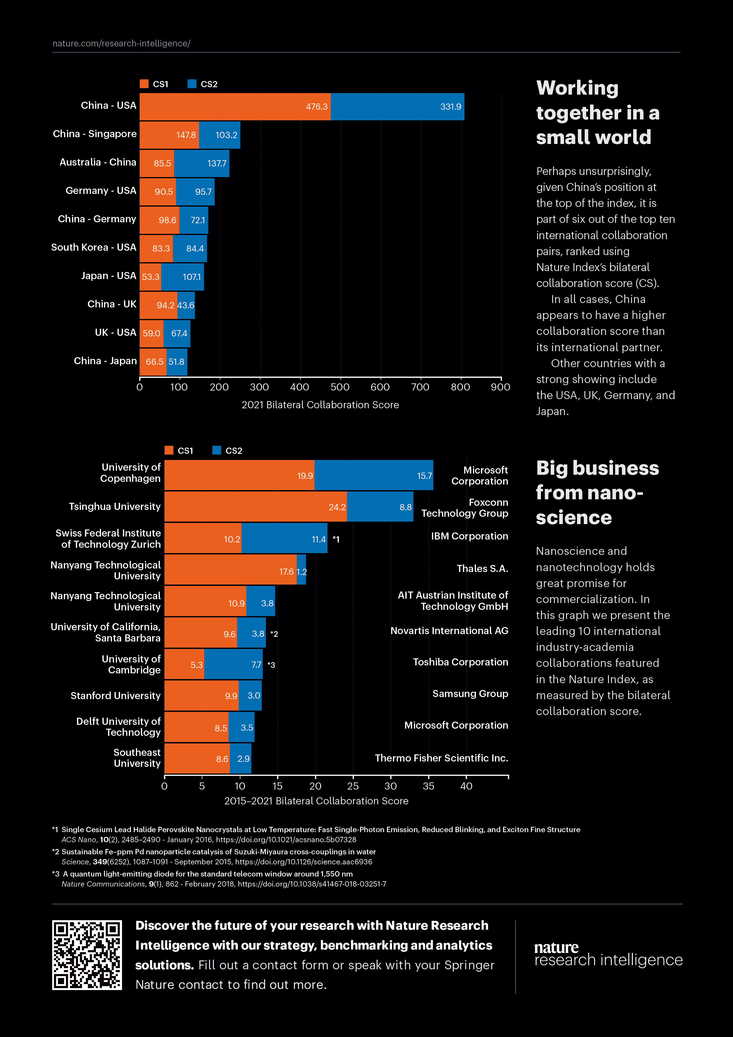
Using a stacked bar chart to display the top collaborating countries in nanotechnology, as scored by Nature Index's Collaboration Score Index, provides a visually engaging way to analyze international research partnerships. The stacked design allows the contributions of individual countries to be broken down into segments, representing collaboration with various global research institutions or regions. This structure helps to highlight not just the total level of collaboration for each country but also the diversity and distribution of their international research ties. By seeing the stacked segments, viewers can quickly identify which countries are involved in a broad network of collaborations and which have concentrated partnerships with specific regions, offering insight into the global interconnectedness of nanotechnology research.
Furthermore, a stacked bar chart provides a clearer comparison between countries in terms of their overall performance and collaborative efforts within the field of nanotechnology. It is easier to distinguish the leaders in global collaboration from those with a more limited scope of international partnerships. While other chart types, such as line charts or pie charts, may focus on singular values or trends over time, the stacked bar chart allows for a more granular analysis of the collaboration landscape. This enables stakeholders to assess both the total collaboration volume and the quality of relationships between countries, helping policymakers, researchers, and funding bodies understand global dynamics and potential areas for future international cooperation in nanotechnology research.
Using a stacked bar chart to display the top collaborating companies in nanotechnology, as scored by Nature Index's Collaboration Score Index, offers a comprehensive and visually intuitive way to analyze global corporate partnerships in this field. The stacked bar chart format breaks down the total collaboration score into segments, representing each company’s collaborative performance with various research institutes, universities, and other industry partners worldwide. This structure allows for an easy comparison between companies based on their overall collaboration scores while also showcasing the diversity of their global partnerships. It highlights which companies have a broad network of collaborations, indicating their central role in advancing nanotechnology, and which have more concentrated or specialized partnerships, giving insight into the strategic positioning of these firms within the research ecosystem.
Additionally, a stacked bar chart enables viewers to quickly identify shifts in collaboration patterns among top companies over time. Since the chart displays the collaboration data in a segmented form, it’s easier to see how each company’s involvement in various research partnerships has evolved. This makes the chart highly valuable for stakeholders looking to assess the competitive landscape in nanotechnology, particularly in understanding which companies are fostering the most significant collaborations and how their partnerships contribute to global advancements in the field. By showcasing both the scale and breadth of collaborations, the stacked bar chart can aid decision-making in terms of funding, partnership development, and strategic planning for both corporate and academic entities working within nanotechnology.
See our data in a new light


Nature Research Intelligence
Data & Analytics Solutions
© 2024 Springer Nature Limited