How AI Can Refine Your SDG Research Strategy
Published
June 2023
Contributors
Jack England (ACE - Economist)
Shamika Shah (ACE - Customer Success Manager)
Romina Nanwani (Marketing Planning Product & Solutions - Senior Marketing Manager)
This Nature Research Intelligence (NRI) flyer was created to support our sales teams at the 2023 INORMS (International Network of Research Management Societies) conference, enabling richer conversations with attendees about our analytical competencies. The two-page infographic showcases the power of artificial intelligence (AI) in helping the research community make informed strategic decisions and grow the impact of their research relating to the UN’s Sustainable Development Goals (SDGs).
Using the Dimensions database to draw out climate action publications over a ten-year period, the data analysis uncovered the leading fields of research (FoR) based on research productivity and relative citation ratio metrics, an international spread of climate action research and a dynamic ranking of the key funders for climate action research projects.
To highlight the capabilities of Nature Navigator, Dimensions data was ingested into the product to produce a topic anatomy of this publication landscape – identifying the topics driving mentions within climate action research.
Simple visuals were used to highlight the use of Artifcial Intelligence in SDG research, to highlight global publication variability in research between 2013 and 2021. This conference flyer handout needed to quickly engage readers, conveying key publishing trends easily, clearly and concisely, without risk of coonfusing or alientating the target audience. As a resultm we could not stra to far from using more traditonal chart types, familiar to all. Further, such charting forms are already regularly used to convey data of Nature Index, so a precedence was set in advance for NRI to adhere to.
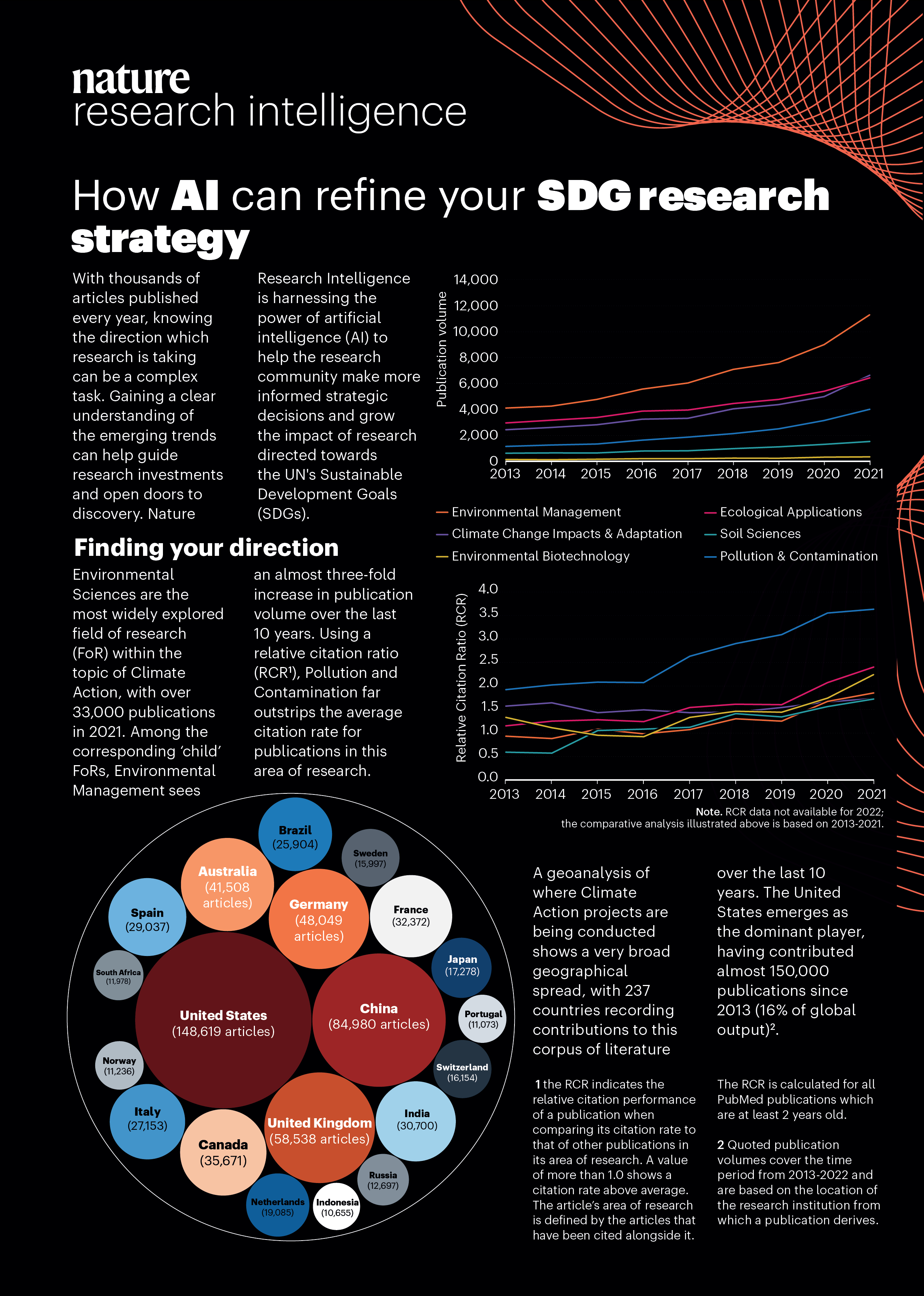
Using a simple traditional line chart to display the publication volume increase between 2013 and 2021 for AI research into Development Goals offers a clear, straightforward visualization of trends over time. Line charts excel at showing changes in data points across a continuous time series, which is ideal for tracking the growth in research publications. The X-axis can represent the years from 2013 to 2021, while the Y-axis indicates the volume of publications related to AI research for development goals. The line on the chart provides an immediate visual representation of how the volume of publications has evolved over this period, allowing viewers to identify key moments of rapid growth, plateaus, or fluctuations. This simplicity makes line charts particularly effective for conveying long-term trends in a way that is easy for stakeholders to grasp.
Additionally, a line chart allows for easy comparisons and trend analysis, especially when multiple lines are used to represent different development goals or subfields within AI research. For instance, lines could be used to track publications on AI related to health, education, or climate change, offering insights into which areas have seen the most research activity. The continuity of a line chart ensures that shifts in publication volume are clearly visible, enabling researchers, policymakers, and funding organizations to assess how AI research is contributing to the achievement of specific development goals over time. Its simplicity makes it an accessible and effective tool for understanding the trajectory of AI research, without the complexity or potential clutter of other chart types like bar or scatter plots.
Using a circle packing visualization to encode and display a geoanalysis of the countries with the largest volume of publication output on AI research since 2013 offers a visually captivating and intuitive approach to understanding global trends. In a circle packing layout, each country is represented by a circle whose size corresponds to the volume of AI publications produced, with larger circles indicating higher publication output. These circles are nested within a larger container, with neighboring countries placed in proximity to one another, creating a dynamic representation of the global landscape. This approach not only makes it easy to compare countries based on their AI research output but also adds a geographical element by positioning the countries closer together or farther apart, visually reflecting their global relationships. The novel nature of this visualization makes it engaging and allows for a more immediate understanding of publication patterns across different regions.
In addition to its visual appeal, circle packing offers a more efficient way of encoding multiple levels of information in a compact space compared to traditional bar or line charts. By using the area of each circle to represent publication volume, the viewer can quickly assess the relative scale of research output for each country. This visualization also allows for the incorporation of color coding or additional layers of information, such as categorizing countries by region or development status, which can provide further insights into global research trends. Circle packing, with its compact and aesthetically pleasing design, not only communicates the scale of publication volume but also enhances the user's ability to quickly discern global research priorities, making it an effective tool for a geoanalysis of AI research publication outputs since 2013.
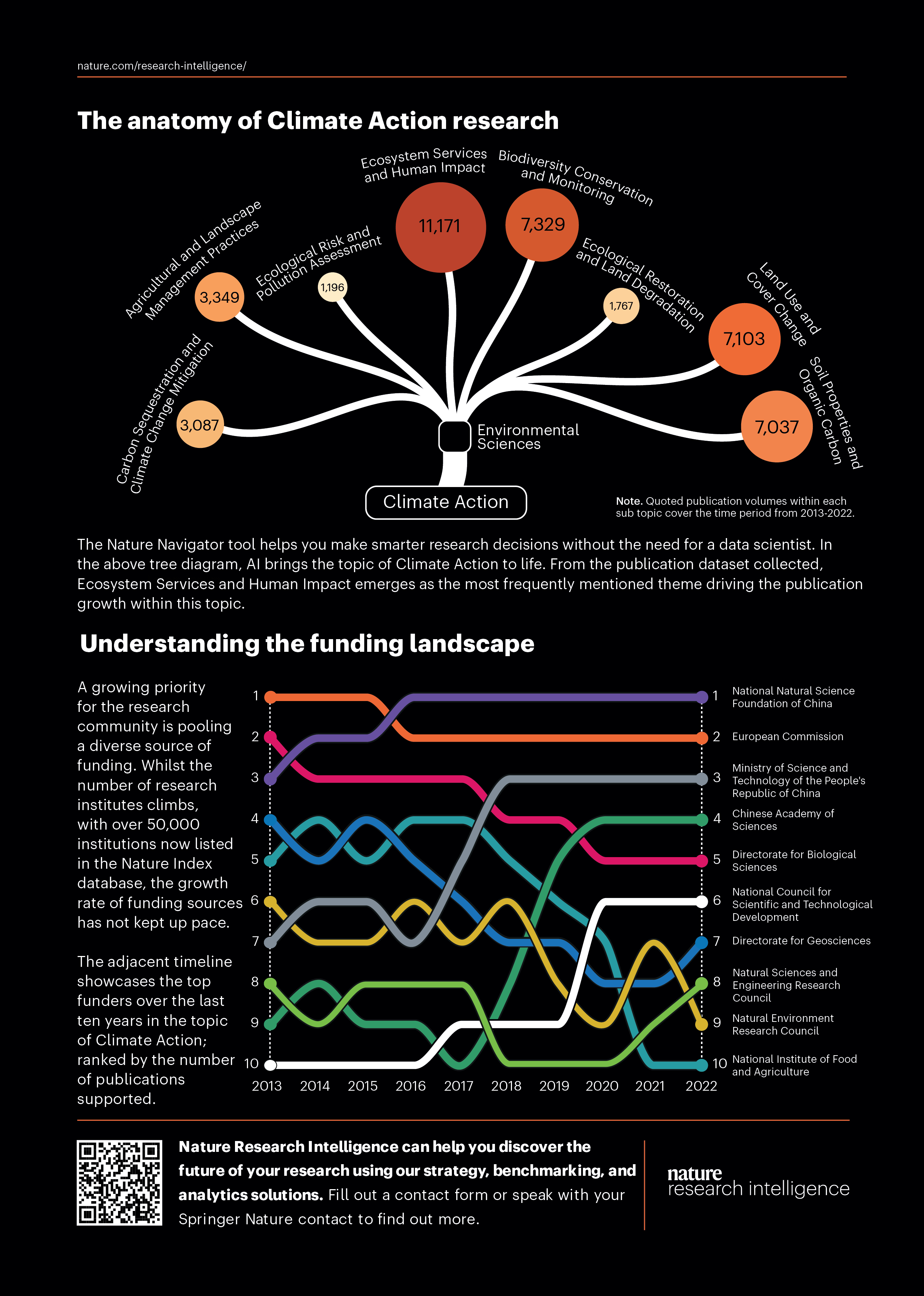
The newly developed topic anatomy-style visualization, created by our NRI analytics team, provides a sophisticated and dynamic way to display the hierarchy of the most active research topics within the broader domain of Climate Action. This innovative visualization structure breaks down the main topic into nested subtopics, allowing users to easily explore the relationships and relative activity levels of various research areas. Each subtopic is represented in a way that reflects its significance or activity, with the most prominent and active topics—such as "Ecosystem Services and Human Impact"—appearing as the largest nodes within the structure. This approach allows stakeholders to grasp not only the prominence of specific topics like "Ecosystem Services and Human Impact" but also how they interrelate with other subfields within the broader Climate Action research landscape, creating an engaging and comprehensive view of research priorities.
One of the key strengths of the topic anatomy-style visualization is its ability to visually represent both the hierarchical nature and the relative importance of subtopics within a complex field like Climate Action. By scaling subtopics according to their research activity, the visualization makes it immediately clear which areas are generating the most publications, funding, or research attention. For example, the central position and larger size of "Ecosystem Services and Human Impact" highlight its dominant role in the climate action discourse, signaling its relevance and urgency within the broader field. This tool offers researchers, policymakers, and organizations an intuitive way to identify which areas are most active and where there may be emerging opportunities or gaps in the research agenda, all while fostering a deeper understanding of the interconnectedness within the climate action topic.
A bump line chart provides a novel and engaging way to visualize the changing ranks of the top global research institutes in the field of Artificial Intelligence (AI). Unlike traditional line charts, which typically track continuous data over time, a bump chart focuses on rank order, using lines that "bump" up or down to reflect shifts in position. Each research institute is represented by a line that moves along a time axis, showing how its rank changes from year to year. This allows for an intuitive comparison of institutes, making it clear which ones are improving, maintaining, or declining in their AI research output relative to others. The visual design of the bump chart makes it easy to identify trends, such as sudden surges in rank due to breakthrough research or consistent dominance by a few leading institutions.
The bump line chart is particularly effective in highlighting competition and shifts in leadership within the field of AI research. For example, a clear visual representation of the rankings can reveal if a particular institution has been steadily climbing the ranks, perhaps due to increased publication volume, strategic collaborations, or innovation in AI. Conversely, it also makes it easy to spot any decline in an institute’s position, which could signal stagnation or a decrease in research activity. By focusing on rank rather than absolute publication numbers, the bump chart emphasizes the relative position of each institute within the global AI research landscape, offering valuable insights for policymakers, researchers, and funding bodies looking to assess the dynamic nature of AI research and its most influential contributors over time.
See our data in a new light


Nature Research Intelligence
Data & Analytics Solutions
© 2024 Springer Nature Limited